

 HANDS ON SharePoint
 HANDS ON Teams
 HANDS ON Lists
 HANDS ON tek
 M365 Admin
Relearning the Basics: Getting Comfortable With the New SharePoint Document Libraries
Microsoft has been rolling out a refreshed look for SharePoint Document Libraries, aligning them more closely with the new OneDrive experience. Visually, it’s clean, modern, and unquestionably consistent with Microsoft’s current design language. Functionally… well, things have moved. A lot.
If you’ve been following my Pulse updates, you already know I’m not exactly the biggest fan of these changes, not because they’re bad, but because they’ve forced me to retrain my own muscle memory. After years of going straight to the same corner of the screen to create files, switch views, or open filters, suddenly realizing “oh… it’s not there anymore” is incredibly frustrating.
That said, change happens, and once you understand where everything went, the new experience is usable, even if it comes with extra clicks. So in this article, I want to walk you through the basic functionality that has moved, hidden itself, or changed behavior. If you’re still learning your way around the new libraries, this guide will save you a bit of time (and annoyance).
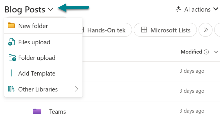
Create or Upload a New File
Let’s start with the biggest shock: the “New” and “Upload” buttons have moved from the left to the right. Yes, after all these years, your muscle memory is officially obsolete.
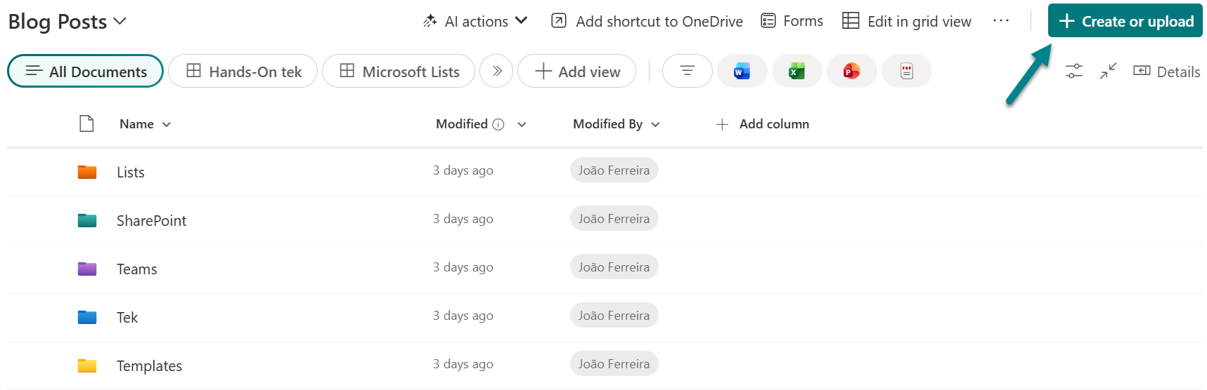
The good news: You can still upload files from the left, but the option is tucked inside the breadcrumb navigation. The catch? That breadcrumb action only supports uploading, not creating new files.
So:
- Creating files → right side of the screen
- Uploading files → right side, or inside the breadcrumb if you prefer the old placement
Managing Document Library Views
The view selector also swapped sides and it’s now on the left, represented by pill-style buttons. When you have multiple views, they overflow into a dropdown.
The actions to manage views are spread across different locations which makes it harder to manage views. A few things to note:
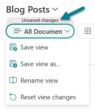
Unsaved Changes
If you tweak a view, SharePoint now clearly shows a tag labeled “Unsaved changes.”
This is great and very visible and lets you save or create a new view directly from the view selector.
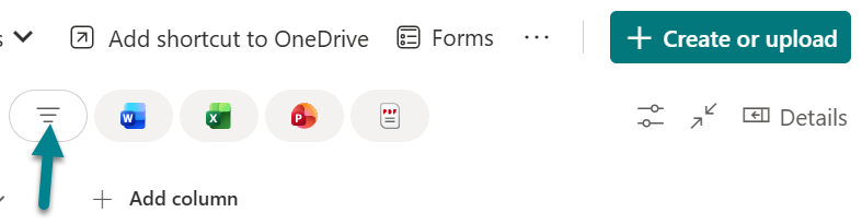
Switching Between List, Compact List, and Tiles
This one is sneaky. In the previous version of SharePoint libraries, these options lived comfortably on the right in the view selector. Now they sit quietly under a small icon still on the right, and this was the area that caused me the most confusion (and time lost) while relearning the interface.
At first glance, it looks like the layout options disappeared. In reality, they were moved to the Options menu.
So if you’re used to switching between Tiles and List from the view selector, that’s gone.
You’ll find those options, along with many other view-related settings on Options menu.
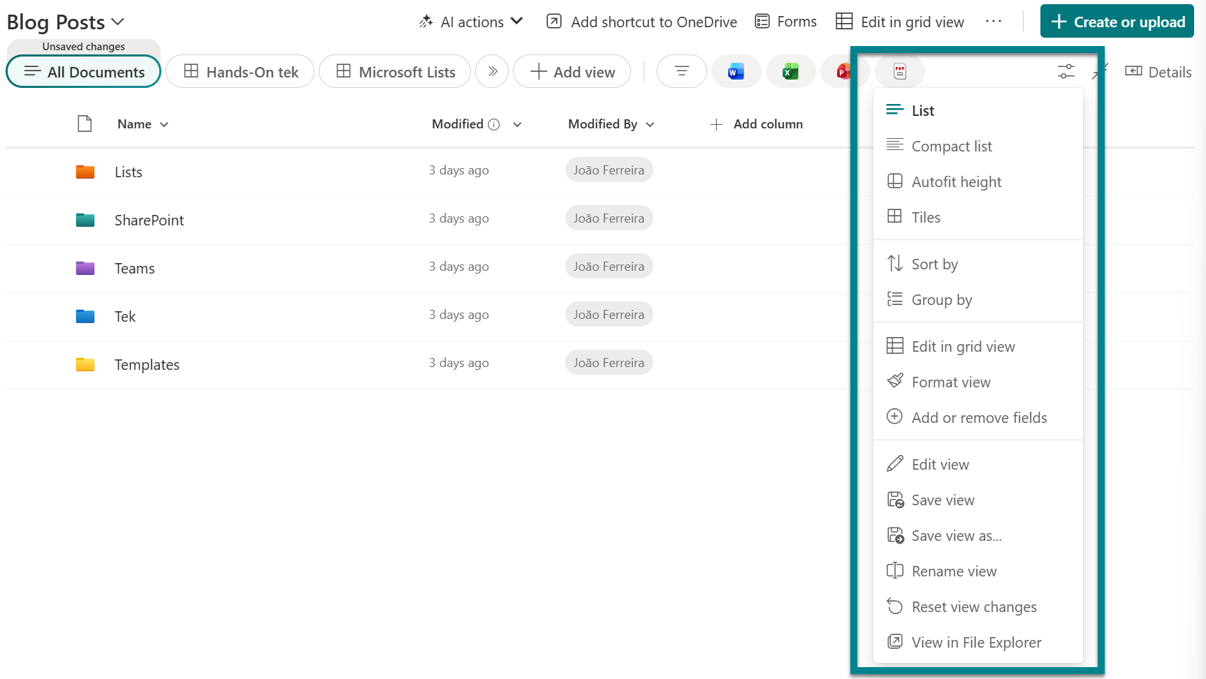
Edit in Grid View
Yes, this moved too. The “Edit in Grid View” button now lives on the right side, near the “Create or Upload” area. The feature works exactly as before, but exiting Grid View is less intuitive.
To Exit Grid View, you must:
- Open the … overflow menu, or
- Open the Options menu on the right
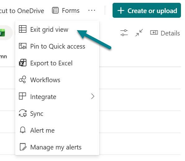
There’s no big “Exit edit mode” banner or button anymore, so this is another one of those moments where you’ll click around wondering where the exit went.
Filters
This is probably the most visually obvious change. The new filter area features large Office application logos, even if your library doesn’t contain Word, Excel, or PowerPoint files. They’re always displayed, which can feel a bit misleading.
To open the actual filter panel:
- Click the first icon next to the Word logo
- This opens the same filter panel you had in the previous SharePoint library experience
The filters themselves haven’t changed much. What changed is the amount of screen real estate dedicated to this section and the way the icons look.
Conclusion
I’m always in favor of product evolution, and SharePoint has reinvented itself many times over the years. But this redesign changes core behaviors that long-time users rely on, and I’m still trying to understand the true productivity benefit behind some of these shifts.
Yes, it looks prettier.
Yes, it aligns with design language in OneDrive.
But SharePoint libraries are not simply a design exercise, they’re a critical part of daily work across organizations. And right now, this redesign introduces more clicks, more hunting, and more disruption to well‑trained muscle memory.
What makes this change even more noticeable is that it creates two different experiences for users: SharePoint in the browser uses the new layout, while document libraries inside Microsoft Teams still use the old one. This means users constantly jump between two UIs for the same feature depending on where they open it. In practical terms, it adds friction and inconsistency to workflows that were previously predictable.
If your libraries use JSON formatting or SPFx customizations, the impact can be even bigger, although the community is already doing a great job documenting what changed.
I hope this article helps you find your way around the new layout faster. And if you’re still clicking the wrong side of the screen… trust me, you’re not alone.


No comments yet